王可樂日文
Scroll to explore ↓
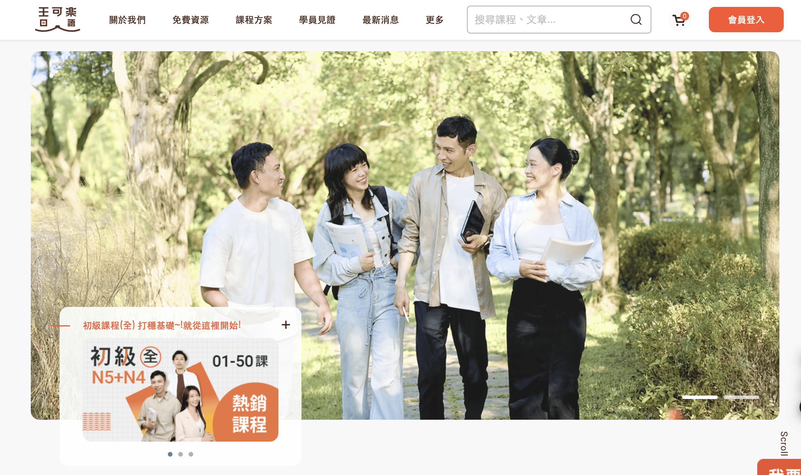
This was a 4-month UI/UX redesign project for 王可樂日文教學, a well-established Japanese learning platform founded in Osaka in 2010. The goal was to restructure the website's information architecture and redesign the user interface to make it more modern, accessible, and user-friendly for students preparing for JLPT or looking for professional Japanese tutoring.
Three core areas transformed to drive real results
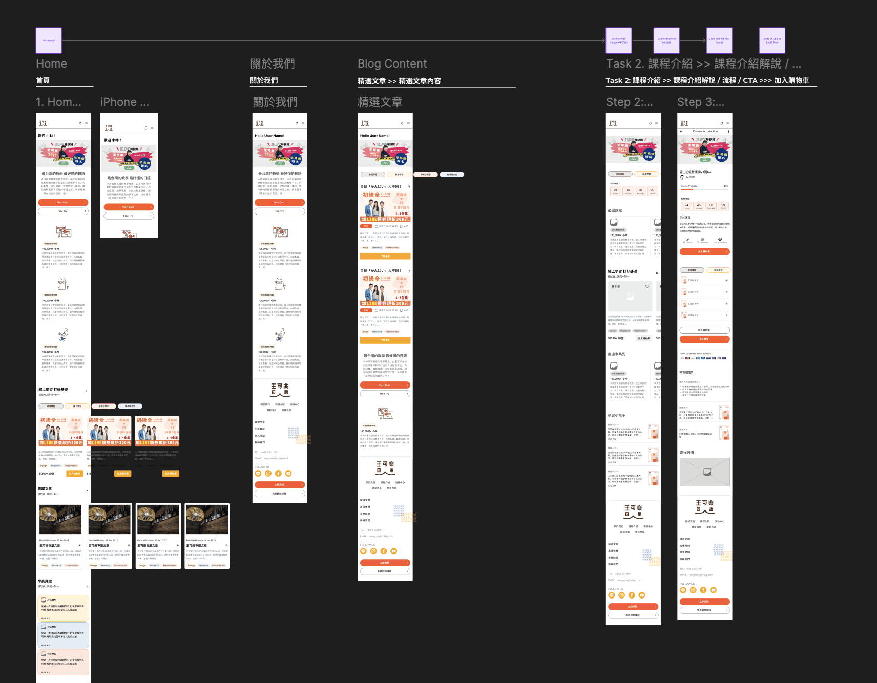
Restructured course layout for easier access. Redesigned CTAs to be more intuitive and action-driven. Streamlined checkout with clear step-by-step guidance. Improving navigation and course selection clarity to reduce drop-offs and increase sign-ups.
Visit Live Site →
Making learning tools and progress tracking more intuitive, keeping users engaged with the platform. Implemented a Q&A-based guide to personalize course selection — helping users make confident decisions without feeling overwhelmed.
Visit Live Site →
Streamlined the purchase process to reduce friction and improve transaction completion rates. Improved swipe gesture awareness in carousels, clarified input options, and added animated feedback to provide a sense of accomplishment.
Visit Live Site →
The primary objective of 王可樂日文教學 is to increase course enrollments and user retention by optimizing the website experience. To achieve this, we focused on…
Improving navigation and course selection clarity to reduce drop-offs and increase sign-ups.
Making learning tools and progress tracking more intuitive, keeping users engaged with the platform.
Streamlining the purchase process to reduce friction and improve transaction completion rates.
Wang Cola Japanese Learning provides online Japanese courses, but user engagement and retention rates were lower than expected. Users found it difficult to stay consistent with their learning schedule and felt the platform lacked interactive features.
How might we improve the user experience to make learning more engaging and effective?
Restructured course layout for easier access. Redesigned CTAs to be more intuitive and action-driven. Streamlined checkout with clear step-by-step guidance.
Implemented a Q&A-based guide to personalize course selection. Helped users make confident decisions without feeling overwhelmed.
Improved user awareness of swipe gestures in carousels. Clarified input options for logging exercises outside the app. Animated feedback provided a sense of accomplishment.
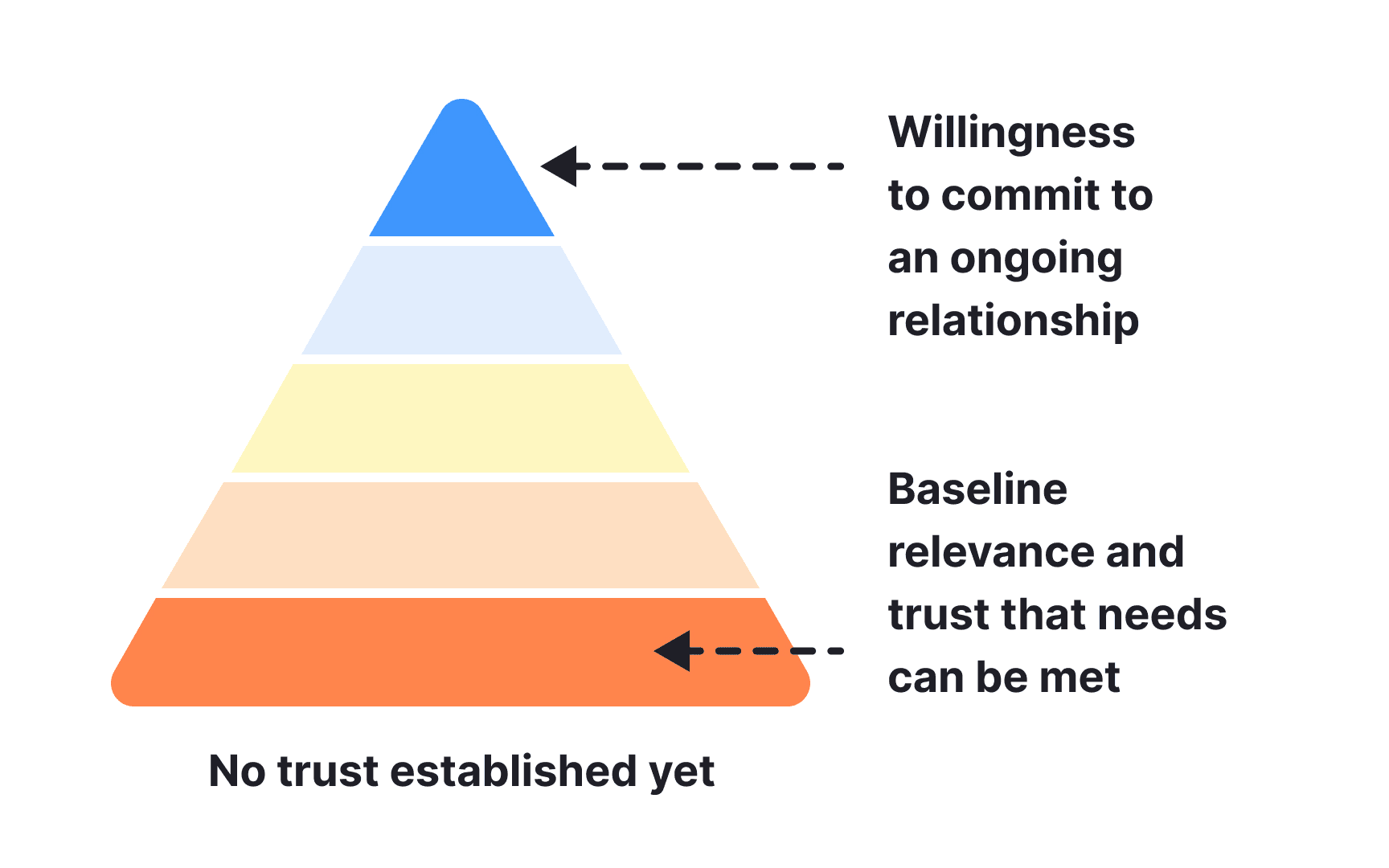
Trust is created through good design, clear information architecture, detailed content, and links to reputable sources.
Users feel lost when information is scattered or hard to find. A clear structure reassures them that the website is well-organized and legitimate.