
Crypto-Tracker
Scroll to explore ↓
A simple, optimized, and visually clear interface for tracking portfolio performance. This was a 2-week Bootcamp design challenge from Le Wagon: to research, design, and prototype a crypto portfolio tracker — from observation to sketching to digital prototype to final development.


Three core areas built to replace manual spreadsheets and give users real clarity
Consolidated dashboard showing total portfolio balance, individual coin performance, and real-time percentage changes. Visual indicators — green for gains, red for losses — make decision-making instant.
View Live Project →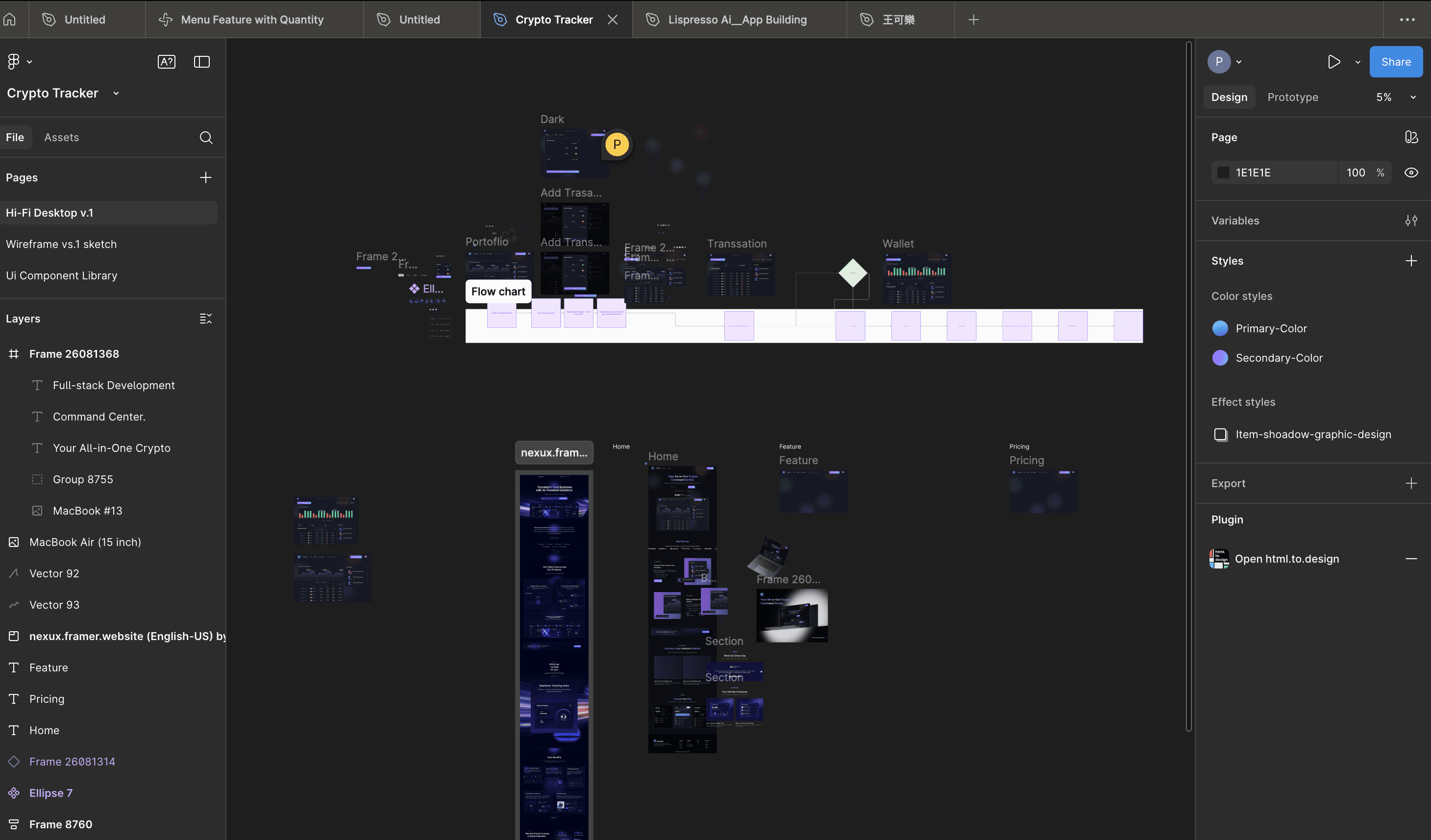
Beginner users need a clear, jargon-free dashboard to replace their spreadsheets. Advanced traders need speed, data density, and performance indicators at a glance. Both needs are met in a single, clean layout.
View Live Project →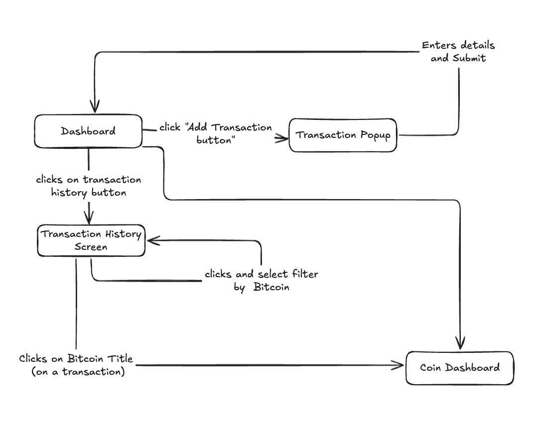
After wireframing to align the team, we moved to high-fidelity desktop designs. Color-coded percentage changes and a minimal layout ensure users can scan their entire portfolio in seconds.
View Live Project →
Nowadays, many people invest in cryptocurrencies across multiple exchanges and wallets. The challenge is that holdings are scattered in different places, making it difficult to track overall portfolio performance in one view.
Most users — both beginners and advanced enthusiasts — end up relying on Google Sheets to manually organize their assets. This is time-consuming, error-prone, and lacks real-time updates or a user-friendly interface.
Opportunity: Create a simple, optimized portfolio tracker where users can view all their crypto assets in one place, with clear insights and an intuitive design.
To solve this, our team designed and developed a Crypto Portfolio Tracker web application. The goal was to replace manual spreadsheets with an easy-to-use, visually clear, and responsive platform.
By focusing on simplicity and optimization, the app makes crypto tracking approachable for beginners while still powerful enough for advanced users.
We organised the tags from High → Low importance based on user flow, to manage our limited time for the project.
We began by framing the problem from the perspective of our target users. Writing user stories helped us capture different levels of crypto experience and use contexts.
"As a beginner crypto user, I want to see all my assets in one place so that I don't need to manage multiple spreadsheets."
"As an advanced trader, I want to quickly check performance changes so that I can make informed investment decisions."
After defining the user stories, our next step was to translate these needs into a visual structure.
These wireframes allowed the team to quickly align on the structure before investing in code. They also helped identify early improvements — such as ensuring percentage changes were color-coded (green for gains, red for losses) to aid quick decision-making.
Our goal was to simplify the way users track their cryptocurrency holdings by consolidating scattered assets into a single, easy-to-read portfolio dashboard. We wanted to replace manual tracking methods like Google Sheets with a tool that felt intuitive and reliable.
Through user stories and quick feedback, we found that many beginners struggled to manage assets spread across different exchanges and wallets. Advanced traders needed real-time performance insights but were frustrated by cluttered tools. Both groups relied heavily on manual spreadsheets.
The UI was designed to be dark, modern, and intuitive. Below are some of the key screens that define the user experience, from adding transactions to visualizing performance.

A clean modal allows users to quickly add new transactions. The form is designed for clarity, with fields for specifying the assets, amounts, and the wallet used.

Clear visual feedback is provided when a transaction is being processed. The loading indicator on the 'Exchange' button keeps the user informed.

The transaction history page provides a comprehensive log of all activities. Users can filter by currency, transaction type, and date to easily find specific records.
A visual representation of income versus outcome over time. This chart helps users understand their performance at a glance, with clear data points for each month.

This was my first project working in a full-stack development team, and it gave me a valuable perspective on how different roles come together to deliver a product.
I learned how the frontend connects with the backend — from the database to the interface — and how design decisions need to align with technical structure.
Overall, this project helped me grow from being focused only on visuals to understanding the end-to-end product flow, making me a stronger UX developer who can collaborate across the stack.